The design for an architect’s early house carries an inordinate weight in his/her biography. I view these inaugural projects as portraits of a person and of a career beyond, imbuing them with myth, projecting details and always giving them the benefit of the doubt. One could say that the success of these houses depends on the success of the careers beyond. Even houses which are inadequate, non-functional or generally bad are still analyzed with precision and admired from broad angles. These works are important to analyze because, in their inadequacy and inexactitude, they often reveal underlying biases as well as the references that have been assimilated into the project.
Mies van der Rohe’s early work, the Patio Houses and the variations drawn from 1931 to 1938, have had an outsized influence on a select group of architects. Mies himself used the typology as an architectural brief while teaching at the Bauhaus: student’s would draw over and over again hundreds of variations, embedding the tendencies and tone of the Patio Houses into his pupils 1. The real assignment of all this repetition was “to judge ‘what good architecture is.’”2 The Patio House is useful to articulate this question because it utilizes a narrow set of design techniques: a high walled rectangular district, a flat roof held by columns, an enclosure of orthogonal glass walls, interior partitions to divide spaces and furniture (often designed by Mies and Lilly Reich) to define the functions.
In an essay by Iñaki Abalos on the Patio House, House for Zarathustra, he argues that the Patio House is an act of self-construction. Abalos focuses on the clarity by which Mies renders the subject within. An Übermensch lives inside, it is an urban man, it is a godless house, a place of reflection. The occupant wears hand-stitched leather shoes, a man who needs to be close to the Agora. In the end, Abalos says that “Mies was creating a self-portrait, was offering his own person as a project.”3
As an architectural assignment the Patio Houses has two end-goals, one presented by Mies van der Rohe, another by Inaki Abalos. Mies chose the house as a way to learn “what good architecture is,” but Abalos’ reading is to use the house as an act of “self-construction.” These two assignments are also the question many architects intend to answer in their early houses; what good architecture is and who the subject within this new definition of space is.

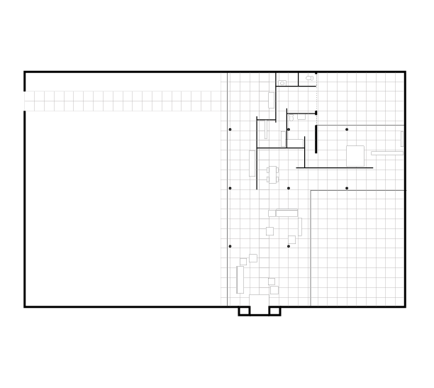
Mies’ Patio Houses we’re never realized by him but we have a fair doppelganger in Philip Johnson’s 9 Ash St. house, otherwise known as Johnson’s “Thesis House.” He built the house for himself during his formal schooling at the Harvard Graduate School of Design, after he’d already been the successful architecture curator at MoMA. In my opinion, Johnson’s design for 9 Ash Street is a direct assimilation of Mies’ concept of the home. Johnson assimilated the Patio House with clarity and would go on to further advance Mies’ agenda and career with his own Mies-like practice 4. The house is incredibly inattentive to its neighbors, a protected precinct with a high wall, but within the wall is the garden with a one bedroom home along the all glass wall dividing the precinct.
In a 1943 issue of Architect Forum, the unknown author makes two statements 1) 9 Ash Street “is probably the best example” of Mies’ attitude towards architecture and 2) “Few people would be at ease in so disciplined a background for everyday living. But the architect, as we have seen, was not concerned with the requirements of anybody except himself.”5 Even in this newspaper’s description the author lays out the two points that Mies and Abalos are interested in, the architectural quality and the subject rendered by the building: Philip Johnson himself.

Another resurgence of this brief would be Rem Koolhaas’ Patio Villa in 1984, otherwise known as A House for Two Friends. At the height of postmodernity Rem’s provocative approach was to reconstruct modernism with the same fervor and literalness as his peers we’re doing with Rome. Koolhaas was at the peak of his Miesian fantasies; Friedrichstrasse Housing in 1980 (which directly credits the Patio Houses in S,M,L,XL), Casa Palestra at the Milan Triennial in 1985-1986, the Video Bus Stop in 1991 and Nexus World Housing in 1991.
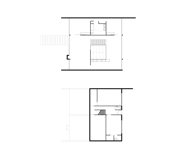
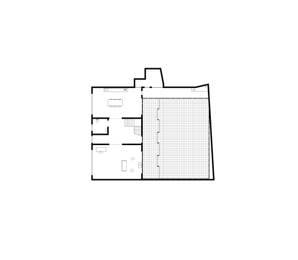
Patio Villa also bears a name that sounds like a colloquial name for the group of Mies Patio House designs. The design itself is an inversion of Miesan principles, placing a patio as an object inside the house which serves multiple levels. One of OMA’s primary contributions to architectural discourse was translations of openness in plan, to section6. In S,M,L,XL the house is titled A Dutch Section, referring to the house’s location on a dyke, the house introduces for one of the first times, the planometric openness of Mies’ patio house to a section. It seems that Rem was struggling to assimilate and articulate his project as a variation of the Patio House, but the site and constraints pushed the project to explore early in his career how to achieve the clarity of Mies’ houses in multi-level spaces. These constraints led to a series of dramatic experiments, the most clear being an direct uphill path from the parking area, through the house, up the stair next to the patio to an outside boardwalk leading towards the woods. Rem’s desire to achieve the Patio House type along with the constraints of the site led to a radical redefinition of architecture, especially in section. The subject within is also clearly stated as A House for Two Friends while, within the project, photos feature a nude person in the shower. Ryue Nishizawa’s would also take on the Patio House brief in his project Weekend House in 1997. A crisp, low black box, the house is a single story with three patios within the boundary. This house displays many Miesian tropes, an extruded column grid, a suppression of verticality, a low chimney, intense planarity between the floor and ceiling, and an incredible openness throughout making the project nearly partition-less.
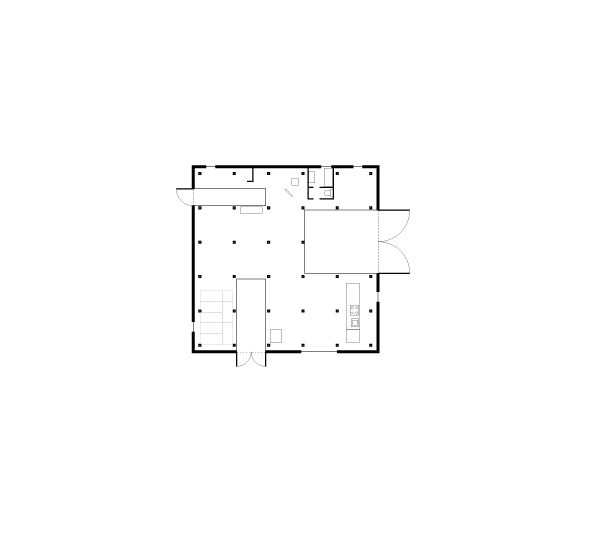
While Nishizawa had been practicing with Kazuyo Sejima for over 10 years, the Weekend House is the first project in establishing the Office of Ryue Nishizawa, a separate office from Sejima. In this respect it is fascinating that even later in his career, Nishizawa chooses to introduce himself to the world with an incredibly direct reference to Mies’ Patio House. Like the Mies house, the design is incredibly internalized, creating a unique set of rules within the boundaries of the house that establish a universe with its own rules and sense of gravity. The rules begin with a rigid and dense 2.4m square column grid which has an endless effect in the small house. Within that dense grid are the introduction of courtyards as spaces of division rather than connection. Unlike Mies’ or Rem’s house, private spaces are separated with the use of the courtyards rather than with partitions, which establish an entirely different sense of continuity then the other houses. Beyond the articulation of a specific definition of good architecture, the subject within also emerges. A natural person, extracted to the countryside, but restricted to an ideal set of nature presented in the courtyards, a miniaturization of nature to the scale of domestic furniture. Many of these techniques of architecture and the subject become distinct to Nishizawa’s practice.
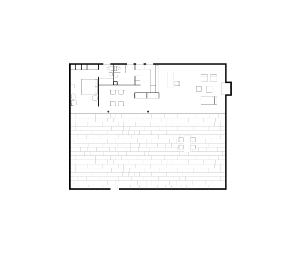
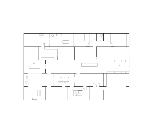
 In 2001-2003, Iñaki Abalos and Juan Herreros, design Casa Mora. Abalos and Herreros had worked on many projects and this is an exception in this list, but simultaneous to this project, Iñaki was writing his essay on the subject of self-construction in Mies Patio Houses, published in 2001. Casa Mora remains unbuilt but is presented in a series of plans with an almost identical proportion to Mies’ House with Three Courtyards. The house explicitly rejects Mies’ style of free plan, but strongly preserves the lack of hierarchy between domestic parts by introducing a stack of rectangular rooms that all share one dimension. The courtyards in the project are indistinguishable from the interior rooms- the hierarchies of facade, window, and patio are rendered neutral. Like Mies’ project, the intense orthogonal rigidity of the architecture elements actually creates dynamic and flowing circulation paths. To further the effect of openness, Abalos and Herreros show a furniture plan with all of the walls removed. The plan appears to be an almost functioning plan (at least by Mies’ standards)- the beds are far enough apart to ensure privacy, the kitchen appears far from the bedroom, but diagonal to the dining room, etc. Suddenly a deeply Miesan aura emerges- a house described only in exterior boundary and the minimum elements of life within.
 Only a few years after, OFFICE KGDVS projects an extension to a house which they call a Summer House, designed and built from 2004-2006. It is their first house design which they widely publish (though it is their 7th project), and it marks a distinct switch from other previous approaches by the introduction of a more literal take on Mies’ Patio House. The extension has a simple articulation – a roof resisting on a rectangular wall forming a large patio, a continuous set of square concrete pavers, and a glass partition dividing conditioned space from unconditioned. One of unique additions is the removal of columns entirely and replacing them with mirrored structural glass panels, the width of one paver. It appears that OFFICE’s decisions to add mirror to the structural glass, rather then to emphasize the transparency, directly addresses the chromium plated columns of the Patio Houses. The concrete paver grid which is seamless from inside to outside is denser than Mies, but combined with the extended roof it produces the most convincing version so far of what the Patio House continuity would have felt like. Another notable detail is the 1m grid of black steel posts which circulate around the entire court like Mies’ brick wall, including the interior face of the existing house. The most intriguing part of this lightweight wall is the way it corrects the geometry of the irregular shaped courtyard- insisting on a rectangle instead of existing shape. OFFICE’s project is a sort of Patio House dropped into an irregular lot, scaling the exterior wall until it would fit maximally, but remain orthogonal. In the leftovers spaces between the rectangular patio and the existing wall are the necessary functions of the courtyard. This initial strategy embodies what will become a trademark of OFFICE KGDVS, geometric correction, distortion and thereby the creation of a sharp edge. The subject within (though the client is rumored to be Maarten van Severen) is a distinctly urban man. The literalness of the pavers, the metal ceiling, the single tree, you can imagine the clothing of the occupant, an urbanite, this time wearing Common Projects instead of Mies’ leather shoes.
 Detlef Mertins, a Mies scholar, writes that “Mies wanted every person, like every building, to be free to realise their own immanent identity for him, the aim of order was to bring together self-generated individualities without impinging on that freedom7” What I doubt is that Mies’ intended his Bauhaus house brief to become an act of self-generation for architects themselves. It’s a meta assignment, that through assimilating the Patio House into their practice, different architects would be able to achieve the distinct goals of their own definitions of architecture. The Patio Houses do not describe just one man, but now serve as the medium for describing other people. The house clearly looms as a heavy burden for many architects: Johnson, Koolhaas, Nishizawa, Abalos Herreros and Geers and van Severen. There are other variations of the project: Valerio Olgiati’s Villa Alem, Smiljan Radic’s house, The Smithson’s Solar Pavilion, Pierre Koenig’s Stahl House, 51n4e Arteconomy and many more.
The Patio House has been fully assimilated into architectural practice and as we lay multiple readings from different authors on top of this project, the Patio House eventually disappears. But by recognizing the subject of assimilation we see distinct readings of Mies’ project of individualization and a case of assimilation so deeply ingrained in architecture that it becomes a medium of expression itself. When a reference point achieves this kind of unanimity, it loses its wholeness, but also produces one definition of a medium within architecture. In one sense the Patio House now has more in common with oil on canvas then it does with a country house. Through the narrow set of architectural tools (the wall, the precinct, the glass, the grid etc), a young architect can prioritize, research into what makes good architecture and defines a subject within. Combined, the answers to these two questions can define the author of the house, a self-portrait in a Patio House.
P.S.
A letter to myself inaugurating this piece of research:
“I find myself in a curious position: I’m in the middle of designing my first house, holding all the anxiety of the inaugural project, and I have a narrow obsession trying to realize aspects of Mies van der Rohe’s House with Three Patios. Late into the realization of this house, it occurs to me that I am not the only architect who had dwelled on this reference for their inaugural house. I can’t shake the feeling and deep desire to realize an American variation of the Patio House. In this case, the house is defined by the massive roof sitting on top of a garden wall. A 1 foot thick double stud forms the edge of the house, never turning a corner, never forming a prism. A tall privacy fence delineates the patio and instead of a garage, merely a square paved platform to park on. The interior lacks hierarchy, a large space, adjoined by bedrooms, and office and a bathroom… There are many details in the planning of this house that relate directly to the Patio Houses. Maybe what I’m feeling is the pent up Miesian utopia presented by the Patio House itself. The feeling appears to lie dormant in many architects, waiting for the moment to realize it. Having this feeling does not automatically absorb me into this elite group, but instead gives me immense caution, approaching the project with the same reference point is a dangerous point of entry.”
1. Mies, Detlef Mertins, 2014, Phaidon Press Limited. Pg.196
2. Mertins, Pg. 197
3. The Good Life, Zarathustra’s House, Inaki Abalos, First Published 2001 by Editorial Gustavo Gili, 2017, Park Books. Pg. 44
4.Johnson had already been a long time Mies advocate, commissioning him and Lilly Reich to design his apartment in New York in 1930-31.
5.Houses, Unknown Author, The Architectural Forum, December 1943. Pg. 91
6.Rem Koolhaas: A Kind of Architect, Markus Heidingsfelder, 2008.
7.Modernity Unbound: Other HIstories of Architectural Modernity, Same Difference, Detlef Mertins, 2011, AA Publications. Pg. 142.
Nile Greenberg is an Adjunct Assistant Professor at Columbia University. The forthcoming book, The Advanced School of Collective Feeling, will be published by Park Books in 2018, co-authored by Nile and Matthew Kennedy.
Before founding NILE, Nile Greenberg worked at MOS Architects, SO – IL, and Leong Leong in New York and Los Angeles. His past experience focused on cultural, public and residential architecture. He holds a Masters of Architecture from Columbia University.

